Adds support for Windows 11 along with improved memory management for AvalonDock.
Features
- Adds support for Microsoft Windows 11.
- New LiveExplorer allows you to explore different Toolkit controls.
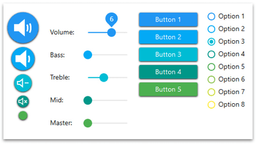
- All controls can now be used under the new MaterialDesign theme.
- AvalonDock
- Improved memory management.
- A custom NavigatorWindow can now be created.
- Using the ReplaceChild method from LayoutDocumentPane or LayoutAnchorablePane now replaces the child without modifying the SelectedContentIndex.
- The pin icon is now collapsed instead of hidden when LayoutDocuments have their CanTogglePin property set to false.
- The NavigatorWindow now displays only the enabled LayoutDocuments/LayoutAnchorables.
- New property, called DockingManager.AutoHideWindowClosingTimer, can now be used to customize the waiting time before an AutoHideWindow automatically closes.
- Using InputBindings on the DockingManager's parent window now transfers the InputBindings to the floating windows.
- Using threads and DockingManager now prevents InvalidOperationExceptions.
- There is now a DynamicResource tag instead of a StaticResource to customize the DropDown and regular buttons.
- LiveExplorer
- The AvalonDock control now includes a new sample demonstrating how to set DocumentSources/AnchorableSources.
- Added Properties sample to the AvalonDock section to demonstrate the use of DockingManager properties.
- TimeSpanUpDown sample no longer throws a NullRefException when setting the CurrentDateTimePart to Millisecond when clicking on Up/Down while the control has no value.
- In the Enumeration sample checking/unchecking the ShowSpinner option now toggles/un-toggles the spin.
- In the Theming sample for the MetroDark theme a white foreground is now used for the names of controls making the text readable.
- Added Advanced ContextMenu sample in PropertyGrid View to demonstrate the use of the AdvancedOptionsMenu property.
- Added PropertyGrid EditorComboBoxDefinition Source sample in PropertyGrid View to demonstrate how to bind the EditorComboBoxDefinition ItemsSource to a non-static collection source.
- PropertyGrid
- Properties of type IEnumerable<> now use the Collection editor.
- Modifying a sub-PropertyItem now updates the root Selected object.
- A property of Collection type that doesn’t have a setter now enables the "Add" button of its CollectionEditor.
- When using the Categorized mode, a new attribute, called CategoryPropertyOrderAttribute, can now be used to order the properties in a category. When the value is set to Declaration, the declaration order of the properties on the selected object should now be respected.
- Sub-PropertyItems containing properties of Collection type now display the PropertyGrid.EditorDefinitions in the CollectionEditor's PropertyGrid. Also, a PropertyValueChanged event is now raised when a sub-PropertyItem of Collection type is modified.
- ExtendedTabControl
- It is now possible to dynamically modify the TabControl items.
- Two new properties, NextButtonStyle and PreviousButtonStyle, are now available to customize the Next and Previous buttons.
- The DropDown list of tabs is now updated when using the ItemsSource property and modifying the source.
- The viewable tabItems are now updated accordingly when resizing the MainWindow width.
- Theming
- PropertyItem's ListPropertyItems or CustomPropertyItems can now be themed.
- The ListBoxItems now uses the correct theme when switching between the Metro theme and other themes.
- DateTimePicker
- Using more than one custom DateTimePicker now displays the dropDown button on each of the DateTimePicker.
- DateTimeUpDown and TimePicker, when the control obtains focus, all the date/time text is now selected to improve the editing of content.
- CollectionControl
- Possible deadlocks no longer happen when Items have many properties.
- If the object to copy is an ICloneable object, its Clone method is now called when using the Copy button.
- PieChart
- The pie sections are now drawn correctly when the DataPoints contains a value Y of 0.
- StyleableWindow
- Maximizing the window on a second monitor with a different DPI now correctly sets the window size.
- RichTextBoxFormatBar
- The font family ComboBox now displays formatted fonts.
- MultiCalendar
- The IsSelected property of the CalendarDayButtons now shows a valid value.
- ToggleSwitch
- The CheckedContent/UncheckedContent now displays when themes are used and the property IsCheckedLeft is set to true.
- CheckListBox and CheckComboBox
- The background color of the highlighted item is now correctly themed when setting the IsSelectAllActive property to true. Note that this works only under specific themes.
- DockingManager
- The DocumentPaneTemplate and AnchorablePaneTemplate properties have been removed. To set DocumentPane/AnchorablePane templates, DocumentPaneControlStyle/AnchorablePaneControlStyle can now be used.